Why Accessibility Matters in Presentation Design

When preparing a presentation, one of the first things you should think about is your audience. Your presentation needs to effectively reach all your audience members, and within this, there may be people with disabilities that you may not be aware of or it may not be obvious to you. These disabilities can include colour blindness, hard of hearing, sensory difficulties and more. Did you know that 1 in 12 men and 1 in 200 women have some kind of colour blindness? That's 300 million people in the world according to National Health Services in UK.
Making your presentation more accessible to everyone doesn’t mean sacrificing your PowerPoint presentation slide designs. The benefit of creating accessible presentations is that the process really makes you think about what you are trying to say on each slide. Do the words make sense and do I need alternative visual aid to help explain the context?
As a presentation designer, I follow the the accessibility resources provided by the Association of Registered Graphic Designers when I design for my clients. While not every presentation needs to incorporate each of the best practices for accessibility, there is still a lot that you can do when designing with accessibility in mind. Here are a few guidelines you should consider when designing in PowerPoint.
Contrasting Colour Palette and Images
There are all kinds of colour blindness or visual impairments, and although you can not cater to every one, you can at least use a colour palette that has enough contrast, that way they can distinguish between colour values and shades. Your main colour palette should consist of 2 to 3 colours and your images should be simple to understand. However, colour is not the only solution as a design element to convey meaning. There is also font style, font size, visual hierarchy, shapes and patterns, that are just a few alternative ways you can make your content stand out without relying only on colour.

Contrasting colour palette

Contrasting image

Clear images and graphics
Remove or Simplify Slide Transitions and Animations
Most of my clients don't like complex animations because they find it too distracting when they are presenting and they only keep to simple transitions or in some cases none. Imagine someone who is slightly visually impaired, they would find transitions and animations even more challenging when trying to pay attention to your slides. Even though I offer slide transitions and animations in my services, remember they are just tools and are not essential. You should keep your content easy to read and follow along.
To check if your PowerPoint presentation is accessible, you can use PowerPoint's built in accessibility tool: Microsoft's Rules for the Accessibility Checker
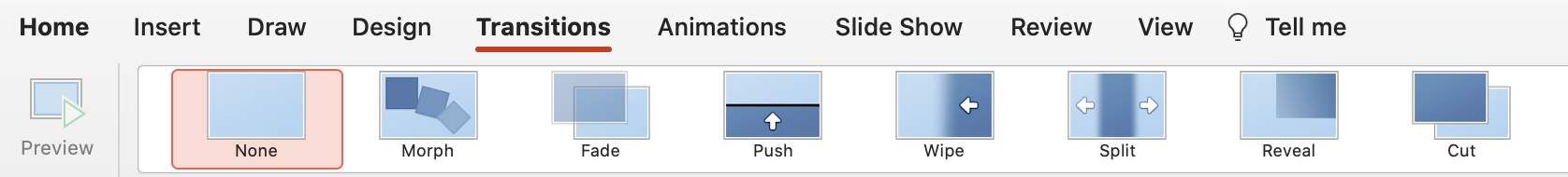
Keep to simple transitions or use none. Eliminate animations altogether.
Designing for PowerPoint Presentation Screen Readers
If your audience receives a copy of your presentation, they may choose to review it using a computer screen reader program. That being said, your presentation should be optimized for this function. It is critical that the content on your slides are organized in a linear and logical order; like a human it reads text from top to bottom and left to right. Your titles should be clear and concise, so the listener can quickly understand what your slide is all about.
Another important thing to consider when designing for screen readers, is writing alternative text or alt text for your images. Alt text is what the screen reader reads to describe an image. It is also the displayed text in place of an image if it cannot be loaded. Images that do not have alt text will be overlooked by screen reader or the actual image file name is read out loud instead. If there are images that are critical to tell your story on the slide, be sure to include a descriptive and concise alt text for each of your images.
Learn more about ways to make your presentation accessible with Microsoft's article: Make your PowerPoint presentations accessible to people with disabilities