10 Tips to Elevate Your PowerPoint Presentation Design
It’s important that your presentation represents your brand and professionalism. Even if you pitch an idea, show a demonstration, or teach a seminar, Designers will follow these PowerPoint design tips to make sure your slides will look elevated, specific to your content. However, if you're working on your own presentation, you can still follow these powerful 10 PowerPoint design tips that will make it look like you’ve spent hours on your outstanding deck!
PowerPoint Design Tips
1. Use Few and Simple Fonts
PowerPoint design experts will pick 2 to 3 fonts to use, along with its variations, such as, light, semi-bold, bold, italics and underline. Sticking with 2 to 3 fonts will make your entire presentation look more professional and provide a cohesive overall look.
The two main font styles you should familiarize with is serif and sans serif. Serif fonts have “feet” that are small strokes attached to the ends of the letters, and examples are Times New Romans, Garamond and Georgia. Sans Serif means “without feet” and they include, Arial, Helvetica and Futura. As an example, you may chose one serif font to use for body copy and one san serif for titles for differentiation of the hierarchy between headers and paragraphs.
2. Substitute Bullet Points for Shapes and Icons
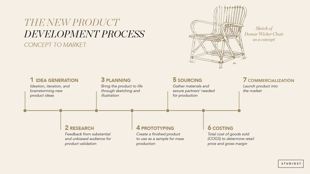
PowerPoint slides should not be text heavy. In fact, it is important to only display brief and critical information because you can lose the attention of the audience quite quickly. Instead of a page full of boring bulleted points, think of a “journey” that you can take your audience on. By replacing bulleted list with groupings in shapes or placing it on a timeline can demonstrate step by step or in chronological order the information in a more interesting manner. Another way to display bulleted list, is to use a related icon next to it the point.
Information chart slide
Timeline slide
3. Choose a Colour Palette that Creates Balance and Contrast
Even if you don't have company brand colours, make sure to choose a colour palette that creates balance with each slide and show enough contrast. You can find inspiration for colour combinations on websites like Adobe Color, Color Hunt, Coolor, or a simple Google image search. Your overall presentation will look more polished if you keep things simple, such as, using a light background like white and using dark body copy in black or dark grey, then adding an accent colour or two.
Experiment with different colour palettes to create balance and contrast
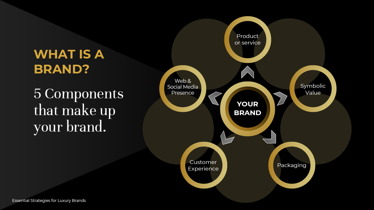
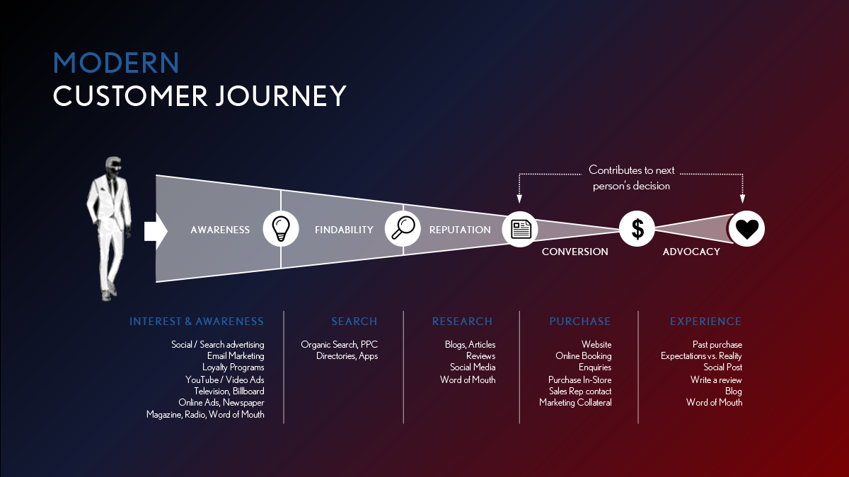
4. Use a Variety of Imagery (illustrations, diagrams, infographics) to Help Convey Your Message
For slides that are either text heavy or contain critical information, designers will use diagrams, infographics or even illustrations to explain the content. Mixing words with images that relate to what is being explained makes absorbing the information easier. Even adding shapes around text will make it easier to emphasize certain messages. Visual learners will find this useful and are will likely stay focused on the content throughout the presentation.
Design infographics to help explain your content
Use more imagery instead of slides with heavy text
5. Use Hierarchy to Show Importance: Size, Space and Alignment Can Make an Impact
Using a couple font sizes will help your audience identify importance and be able to see the content from far away. Creating enough margins and white space between elements helps distinguish hierarchy and gives certain elements the breathing room it needs. There are various tools in PowerPoint that can help with evenly distributing your elements or aligning them, which will give your overall PowerPoint presentation that clean sleek and professional look.
Play with font sizes and space to show hierarchy
Evenly distributed and aligned elements will make your presentation look polished
6. Use Professional Stock Photos
Photography images help convey your “look” and “feeling” of your message in an effective way, or it can be a design element, like a background image. Browse through your image library and pull out ones that can make the storytelling process easier. If you don't have an image library, there are professional stock photo websites that you can purchase affordable images from and reuse them for future marketing since you will own a license to them. Using a similar style and colour palette of professional images can really make your presentation cohesive, as well as, stand out and provide that wow factor.
Stock photos will make your presentations professional
Find photos from your image library
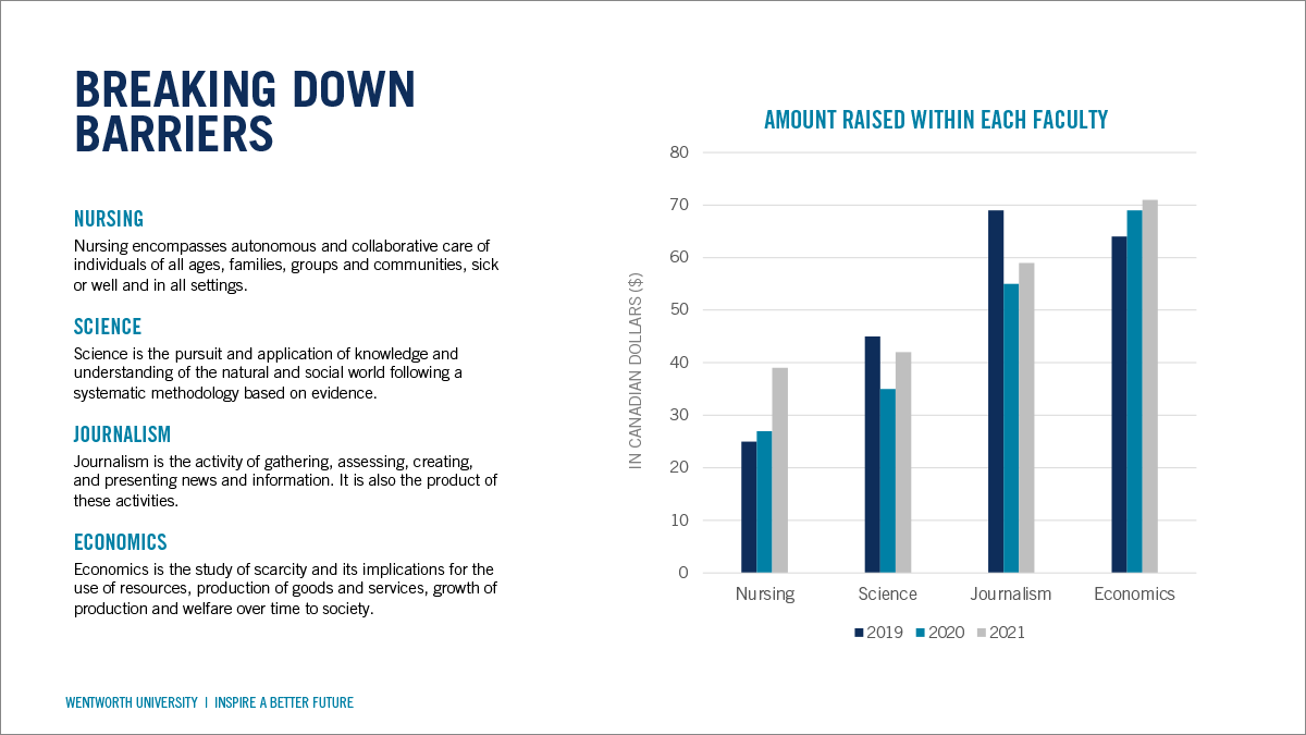
7. Customize Charts and Graphs
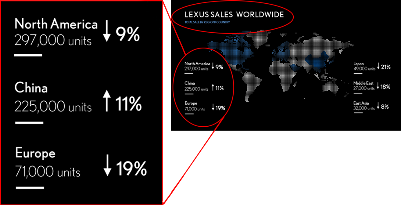
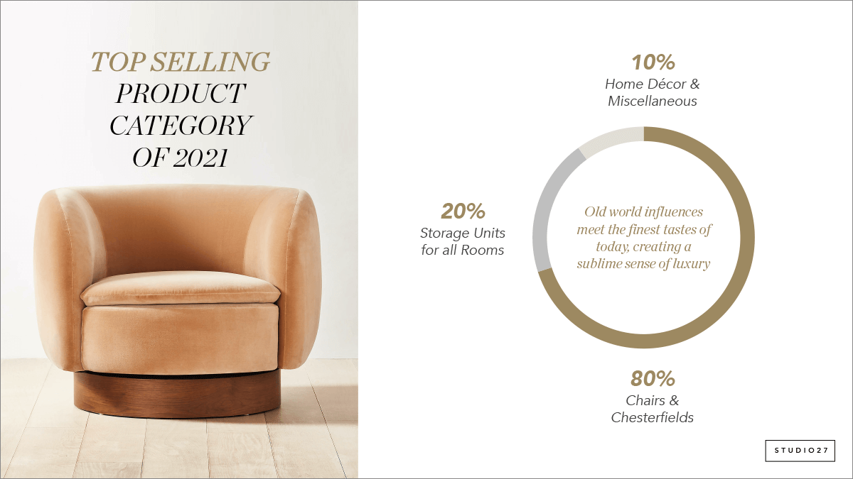
For presentations that contain numbers, such as financials or research, they will utilize charts and graphs to help represent the information. These can be generated using excel with PowerPoint's generic graphs. To make them appear more on brand, a designer will at least change their colours to match the corporate brand colours, but as a further step, some professional designers will redesign bar graphs, pie graphs and charts from scratch to give it a specific style.
They may use the shapes and tool in PowerPoint or use another designer program such as Adobe Illustrator. This is a custom feature that gives you that edge over other presentations and make your entire brand image look more elevated.
Use your brand colours to customize charts and graphs
Customize your chart design style to suit your brand
8. Use Simple Slide Transitions and Animations
Slide transitions and animations are tools that are available but not always essential. Simple transitions help keep the audience engaged, meanwhile some animations help make it easier to explain your content by revealing some information at a time on a slide. In most cases, less is more for this type of feature. For best practices, professional PowerPoint designers will choose simple slide transitions that are not too distracting and eliminate animations altogether.
Use simple slide transitions and avoid complex animations
9. Customize Your PowerPoint Template
As a professional graphic designer, my clients approach me looking for stunning designs that is on brand with their company. The reason why templates don't work for them is that most PowerPoint template designs are not capable of adapting to their specific content and information. PowerPoint templates are meant to be broken down and reworked to fit your needs and this is time consuming and it takes too long to learn. So what should you do? Before you type away on slides, go to the Master Slide, and edit it according to your brand colours, fonts, page numbers, add your logo etc. Eliminate any slides you don't need and make any new masters that will be helpful specific to your content.
If you still need help with these PowerPoint design tips, you can always reach out to me for any questions. Alternatively, I can help create custom PowerPoint template designs for you and your team to produce multiple decks or I can create PowerPoint presentations from scratch. Save your time and focus more on your speech and your actual business goals instead!
Customize your PowerPoint template with your logo, pagination, titles, colours, fonts and more.
Be consistent for an overall cohesive look
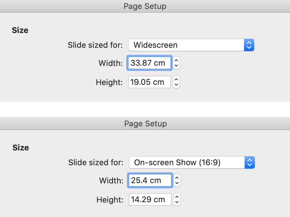
10. Choose the Correct Presentation Size and Orientation
The standard format for a presentation to fit on a wide screen or a computer screen is the option “widescreen” or 16:9 in PowerPoint page settings. However, a lot of presentations are created on letter size 8”x11” landscape, which still works if you specifically want to print out the slides to fit a page perfectly. However, you want to optimize your space on the slides by using up all the screen space that is available, allowing for lots of room to maneuver your content. You can still print widescreen presentations, 16:9 by going into print settings and fit to page, which it already automatically does that.
Standard presentations are widescreen in PowerPoint
16:9 will fit screens and monitors
After applying these 10 PowerPoint design tips, you may find my blog on 5 Ways to Engage Your Audience in a Presentation helpful. I provide tips on how to increase interaction with your audience.
Finally, if these PowerPoint design tips are difficult to perform or you’re running short on time and need help with designing a PowerPoint presentation, you can reach out to me. I’m an expert in PowerPoint and I specialize in presentations that will adapt to your content and branding!


